Selection of Fields Making Up the Form
The operating procedure resembles what you have already seen elsewhere:
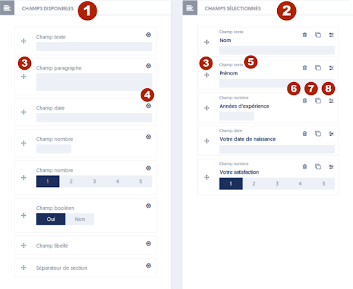
- In the left column, titled Available Fields [1], there are various input fields that you can use.
- In the right column, titled Selected Fields [2], are the fields you have chosen to create your form.
- You can move fields between these columns either by drag-and-drop using the 'handle' corresponding to marker [3] on the figure, or by using the "right arrow" button (marker [4]) and the "trash can" button (marker [6]).
Note that to use drag-and-drop, you must “grab” the items by the ‘handle’, which corresponds to marker [3] on the figure.
Unlike what happens on other pages utilizing drag-and-drop, items in the left column never disappear: you can place a field as many times as you want; it remains available in the left column and can be used again.
You will also notice that items change slightly in appearance depending on whether they are placed in the left column or the right column.
The types of available fields are as follows:
- Text Field: an ordinary input field, for example, for entering a name. The maximum input length can be configured later.
- Identity Field: a special field that allows creating a user through a survey that has been made publicly accessible. You can later select the type of information entered: first name, last name, or company. We will explain the specific use of this type of field later.
- Paragraph Field: a field that allows for the entry of multiple lines of text.
- Date Field: a field that allows the entry of a date; a small window will allow the user to select the date from a calendar.
- Number Field: a field designed for entering a number.
- Selector Field: a field allowing the user to choose an option from a small number of proposed choices. Note that the object shows choices 1, 2, 3, 4, 5, but it can be configured to offer other choices.
- Dropdown List Field: a field allowing the user to select an option from a dropdown list, which appears vertically when opened and closes after a choice has been made. Like the selector, the list of options will be defined once the field is placed.
- Boolean Selector Field: a field that allows the user to respond with Yes or No to a question.
- Multiple Choice Field: this field presents different proposed options arranged vertically, and the user can choose several.
- Label Field: this is actually a pseudo-field, meaning a field that does not require input, but only allows for inserting an additional label in your form.
- Section Separator: here too, it is a pseudo-field that does not require input. It allows grouping different input fields into a block, with a title.
- Media: another pseudo-field that does not require input. It allows inserting media into your form page. This media can be of all kinds: image, video, PDF, etc.
The right column represents your form that is currently under construction.
After placing a field in your survey form, you must at minimum give it a label, which is a short description that tells the user what input is expected from them. For example, in the above example, we used the labels name, first name, and years of experience.
All fields must have a label and a field name; the label is the text presented to the user while the name is used when retrieving the data. The label can be long if necessary; it will be presented over multiple lines. The field name, on the other hand, is short, must be unique in the form, and should allow you to identify the entered data well. It must be less than 40 characters and cannot contain spaces or special characters.
To place fields in your form, you can proceed by drag-and-drop, but you can also use button [4] to instantly create a new field. The field will be inserted either at the end of the form (and you can move it later), or at the level of the dashed line that marks the insertion point for new fields.
When you enter the label for a new field, the application automatically determines a field name, which takes the beginning of the label. You can keep it as is, or modify it among the field options.
You can also, still by drag-and-drop, change the order of fields in the right column. They will be presented to users in this order.
In front of each field, you also have a button [6] that allows you to remove the field from the form, a button [7] that allows you to clone (duplicate) one of the fields, and a button [8] that allows you to set additional options for each input field.
When you have positioned the fields that make up your survey form, don't forget to save the form.