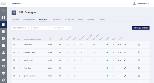
Adapting Pages to Screen Format
All ExperQuiz interfaces adapt to screen format, whether you have a large screen, a laptop, a tablet, or a mobile device. It is sometimes said that the pages are ‘responsive’.
If you are on a workstation with a large screen, you can observe this adaptation by resizing the browser window.
On a narrower screen, some information has been hidden:
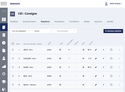
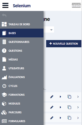
Below, in tablet format: the menu is now hidden, certain information is no longer displayed, and the tabs have been transformed into a dropdown list.
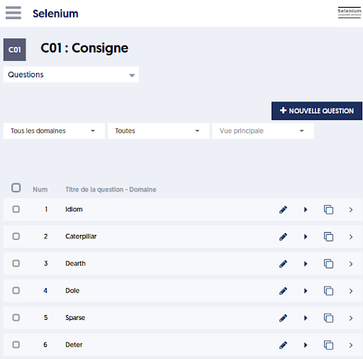
Finally, in mobile format, see below, with the dropdown menu on the right.
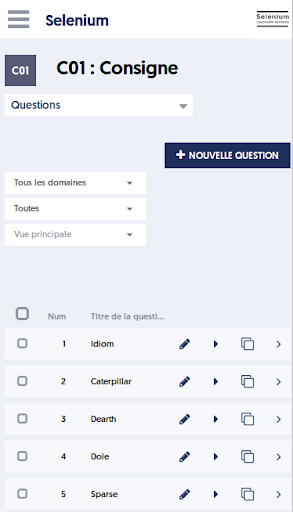
Everything has been designed to ensure the most efficient use possible, regardless of the device and screen size. However, it is clear that administrative tasks will be easier to perform on a large screen.